refine tab styling narrow desktop and mobile
Description
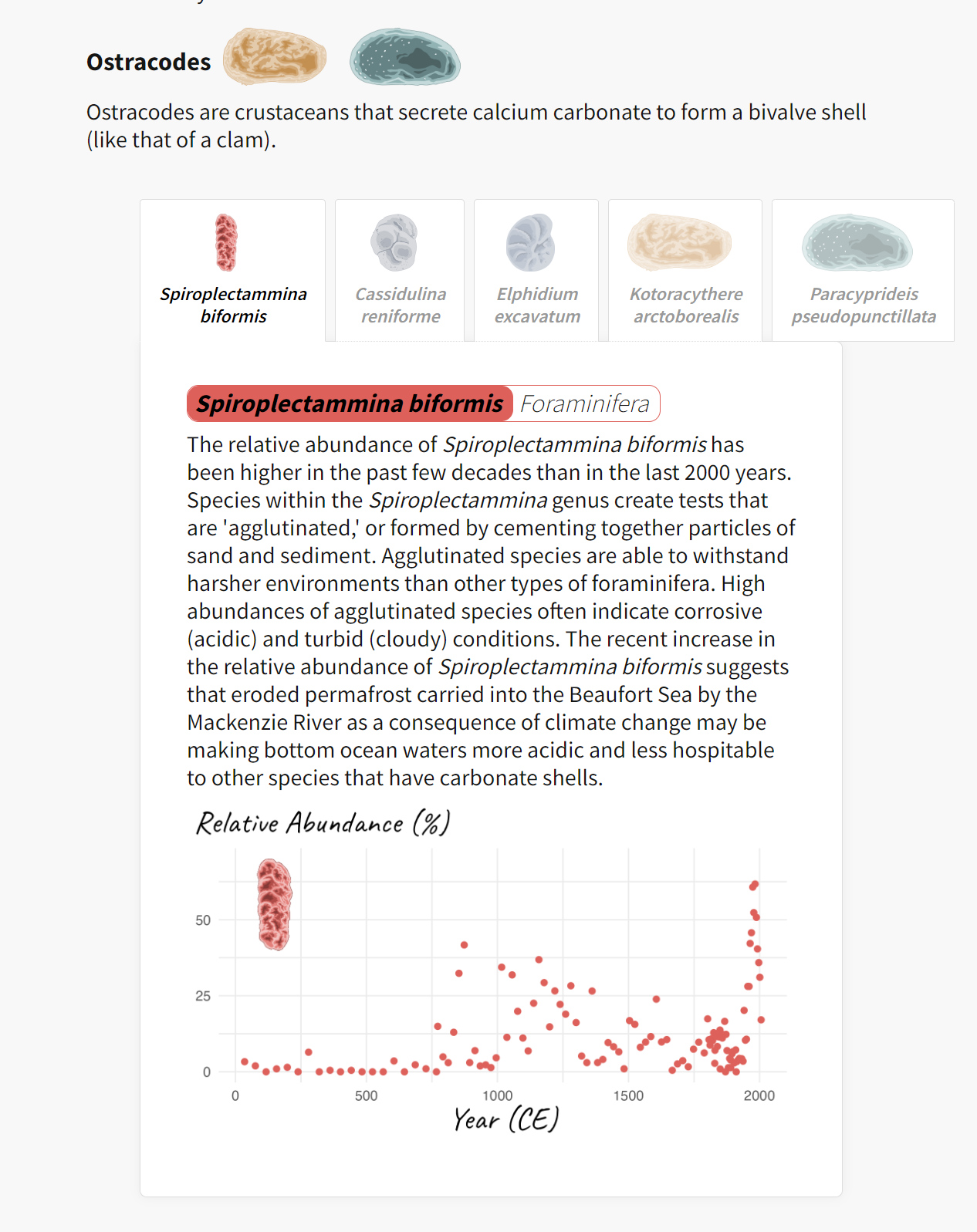
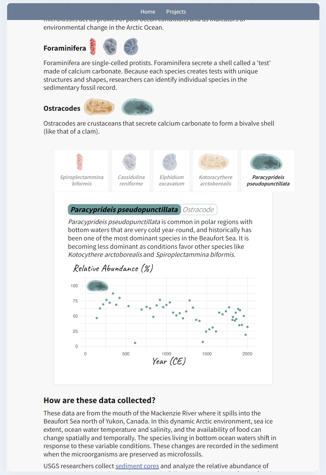
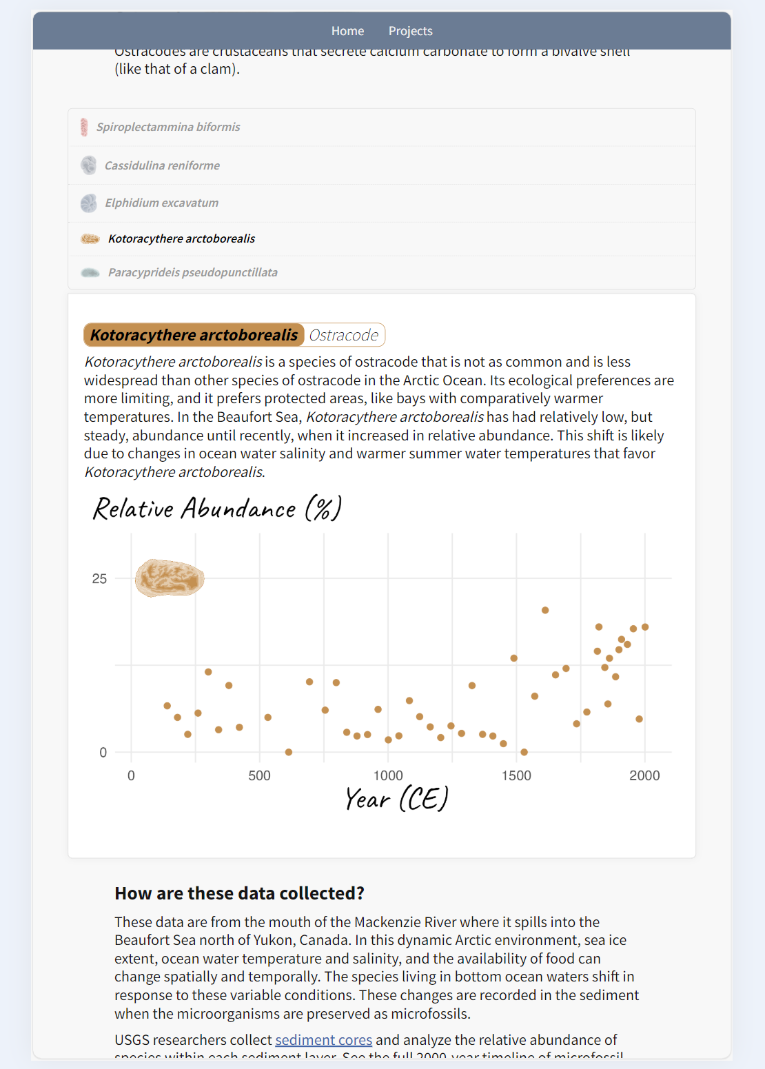
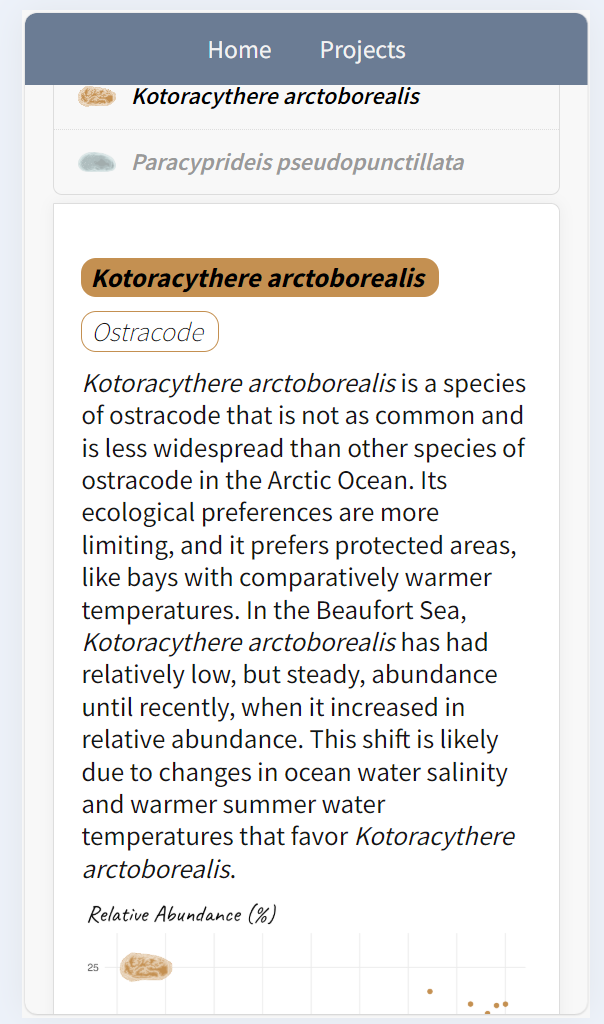
Refines how tabs are style on narrow desktop screens, tablet screens, and mobile devices
Changes Made
| Screen | Previously | Now |
|---|---|---|
| Narrow desktop |

|

|
| Tablet |

|

|
| Mobile |

|

|
How to Test
Provide instructions and/or code necessary to test the changes.
Review Needs
Does this MR include data processing, modeling, or visualization code that will require domain review prior to release?
-
Yes, and I have opened an issue to document the need for review, using the DomainReviewissue template -
Yes, and a domain review issue already exists -
No
Related Issues
Fixes #57 (closed)
Additional Notes
Include any extra information or considerations for reviewers.
Merge Request Checklists
-
Code changes adhere to best practices documented in README.md -
Code has been cleaned the way Vue likes it - run npm run lint --fix -
If applicable, the need for future domain review has been documented in an issue -
Below section documents which browsers the site has been tested on: - Desktop/laptop
-
Chrome -
Safari -
Edge -
Firefox
-
- Mobile device
-
Chrome -
Safari -
Edge -
Firefox
-
- Desktop/laptop